 29
Apr
29
Apr
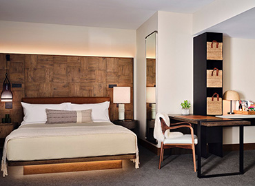
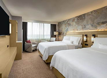
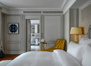
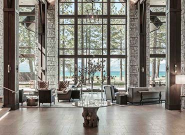
Now hotel industry began to see some beautiful colour combinations and truly stunning hotel interiors emerging. But what exactly do these hotel colours and trends mean in terms of psychology? The theory is that colour is a powerful tool in tapping into the human brain and creating certain feelings and stimulating emotions.
It's important that your decor is not only on trend but also that the colour scheme is creating the ambience that you require. So, what colour schemes for hotels are the best to achieve the decor of your establishment? Today let us introduce one popular colour combinations used on our hotel furniture.
Clean and Serene - Green and White
Green, the bright and vibrant pantone colour of 2017. It was a key colour in 2017, but we're still seeing a lot of natural greens, such as olive. Symbolic of growth, harmony and freshness green works perfectly with the growing trend of blurring the lines between indoor and outdoor spaces. Green has a strong emotional connection with safety and calmness.
White is considered to be the colour of perfection and has strong associations with purity and cleanliness. But white isn’t just white, there are an array of beautiful white tones to choose from to make the personality of your chosen green pop.
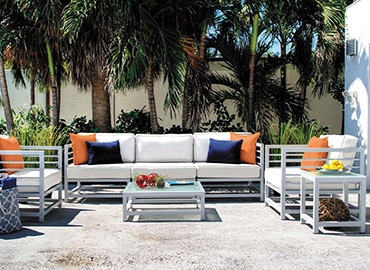
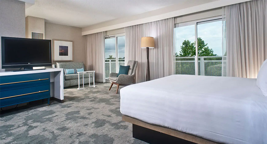
Content and Calm - Blue and Green
A gorgeous combination of two very positive colours. Green is the most calming colour to the human eye, promoting feelings of relaxation, tranquility and harmony. Blue is representative of trust and honesty again promoting relaxation and calmness and is even said to reduce stress.
A perfect choice for spas where your clients desire is to relax and forget the bind of everyday life. Equally, this is the craving of some clientele when staying in your hotel so the scheme would work equally well in a bedroom creating a safe tranquil atmosphere in which they can escape.
Please refer below images about the 2 color made in our furniture ,this is we made for a golf resort for USA .

Next to a strong bright green the stunning contrast creates a striking clean look. With a natural earthy green, although the contrast is less obvious the combination is just as attractive producing a pure, relaxing environment.
Decorating or designing your hotel? Contact our team to discuss your options, we'll happy to help you find the right hotel room colour to complement your decor.of course if you already designed for your hotel we can help you make your design turn into furniture and always be the your furnishing specialist.